| Top |
Coordinate
x from object insertion point |
| Left |
Coordinate
y from text
object insertion |
| Color |
Text font color. Click on the Color bar to change. |
| Print |
Check (mark, tick) the box if you want to print the
content of the object in the final label design printout. |
| Background |
Fills the background of the object with selected color.
Transparent
property must be unchecked for the background color property to take
effect. By default, the background color is white. Click on the Color bar to change to necessary
color. |
| Transparent |
Must be unchecked to make the object's background
color affective. |
| FieldName |
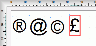
Symbol can be
linked to a database so the
text is pulled from a database field.
FieldName property
is the name of the field from database
table,
we want to bind the Symbol
object to. Database must be
checked (tick, mark) in order to use FieldName
and the field must be boolean, for the symbol to be drawn, otherwise it
is not effective. |
| Database |
Check (tick, mark) in order to link the Symbol object to
a database
table |
| Font height |
Height of text font |
| Font |
Name of Symbol
font face. Font can be selected from the
drop-down list. |
| Symbol |
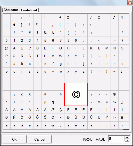
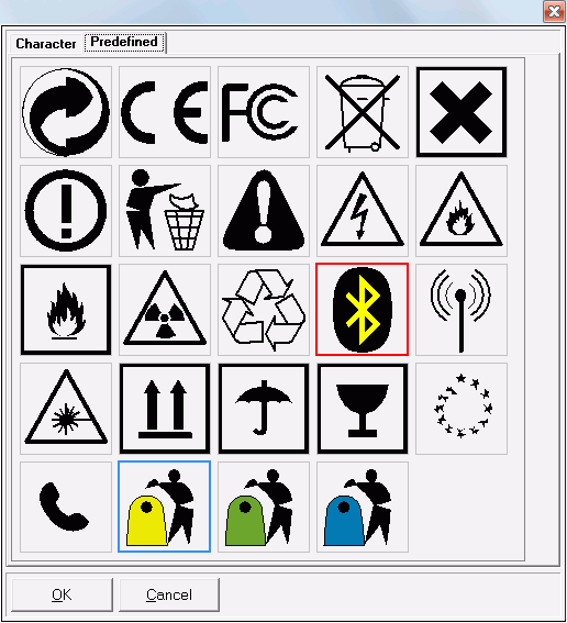
Click the icon to activate Symbol editor, to assign the
character or select the symbol from predefined list (collection). See symbol editor |
| Bold |
To draw text with bold font. |
| Angle |
Angle of inclination. Can be selected from drop-down
list of values: 0, 90, 180 and 270
degrees. |
| Show Border |
Check to draw a frame around the Symbol. See border property |
| Border Color |
Color used to draw the border. Uncheck the Transparent property, the border
will be filled with the selected background color. |
| Border Radius |
To draw the border with rounded corners,
indicate a value greater than zero. |
| Pen Width |
Thickness of the line used for the border. |
| Padding X |
Horizontal separation applied to the left and right of
the object border. |
| Padding Y |
Vertical separation applied above and below the
object border. |


