 Label
Mix provides a wide range of customization options.
You can customize the the designer editor behavior, the way and
manner labels, data, tables are displayed, color scheme
for
the tables, set other program options that are close to your individual
preferences (colors, fonts, size, position, data backup,
password
etc.), select fonts and colors for various elements of the user
interface, show or hide some elements, or change their positioning.
Customization
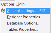
functions are accessible in a special form accessible through Options
menu items.
|
|
|
Description |
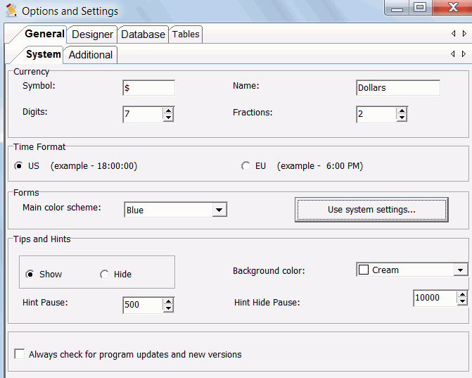
| Currency |
||
| Symbol |
$ |
Symbol of default currency to
use |
| Name |
Dollars (US dollars) | Name of default currency to use |
| Digits |
7 (1 million) |
Number of whole numbers |
| Fractions |
2 |
Number of decimal places after
whole numbers |
| Time
Format |
||
| Date format | dd.mm.yyyy | Specifies date format you want to use by default (if different from your system's value) |
| Forms |
||
| Main color scheme (blue, silver, black) | silver | Set general color scheme for user's interface and forms. |
| Tips and Hint |
||
| 1. show/hide 2. background color 3. Hint Pause 4. Hint Hide Pause |
1. Show 2. Cream 3. 500ms. (1/2sec.) 4. 10000ms. (10sec.) |
1. Shows/hides pop-up (fly-over) with
help tips and hints whenever
you pass your mouse cursor over any of the program's elements (buttons,
icons, panels, etc.) 2. Set hint pop-up background color. Must contrast with black, e.g. white, yellow etc 3. Time interval that passes before the help hint pop-up appears. 4. Time interval hint pop-up will stay visible before disappearing. |
|
|
|
Description |
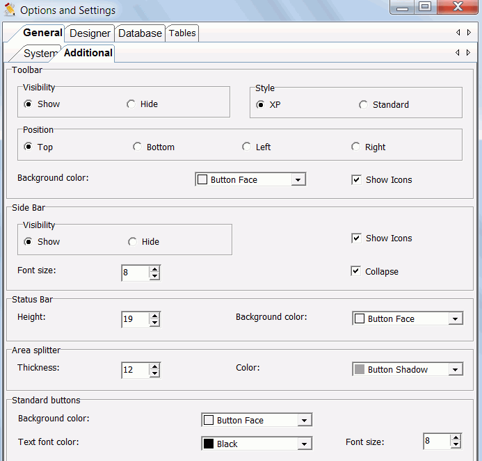
| Toolbar | ||
| 1. Show/Hide 2. Background color 3. Position |
1. Show 2. Button Face 3. Top |
1. Shows/hides toolbar. Toolbar -
contains set of button
icons used for accessing available functions of the program. 2. Set background color for toolbar 3. Position of toolbar |
| Outlook bar (or sidebar) | ||
| 1. Show/Hide 2. Show Icons 3. Collapse 4. Font size |
1. Show 2. Checked(Show) 3. Checked(Yes) 4. 8pt. |
1. Shows/hides sidebar. A column of
panels with icons,
always located on the left of the main window, used for navigating
between
program's sections 2. Shows/hides sidebar icons 3. Minimize the size of sidebar to a single row of icons 4. Sidebar text font size (in points) |
| Status bar | ||
| 1. Background color 2. Height |
1. Button face 2. 19pt. |
1. Set background color for status
bar. A row of
panels, located at the bottom of the main window, that display
information
(hints, tips etc) about the program as it runs. 2. Status bar height (in points) |
| Area Splitter | ||
| 1. Color 2. Thickness |
1. Sky Blue 2. 8pt. |
1. Splitter color. Splitter -
special line
located between two adjacent areas, panels (controls) to allow you to
resize
the controls by clicking and dragging the Splitter. Splitter may be
horizontally
or vertically positioned. 2. Splitter thickness (height - if horizontal, width - if vertical) |
| Standard buttons | ||
| 1. Background color 2. Text font color 3. Text font size |
1. Button face 2. Navy blue 3. 8pt. |
1. Common background color for
all
buttons 2. Common text font color for all buttons and panels 3. Common size for the font (in points) for all buttons and panels |
|
|
|
Description |
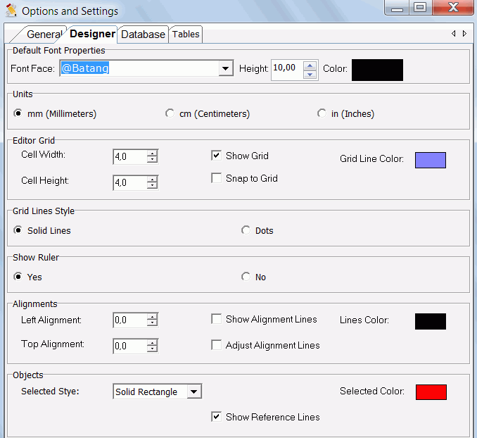
| Font Properties | ||
| 1. Font Face 2. Height 3. Color |
1. First on the list 2. 10pt. 3. Black |
1. Names of the fonts available on your system. 2. Font height 3. Color of the font (click the color bar to change it) |
| Units | ||
| mm (millimeters); cm (centimeters); in (inches) | mm (millimeters) | Unit of measurement to use for label designer, rulers, scaling etc. |
| Editor Grid | ||
| 1. Show Grid* 2. Grid Line Color 3. Cell Width 4. Cell Height 5. Snap to Grid |
1. Yes (checked) 2. Grey 3. 4pt. 4. 4pt. 5. No (unchecked) |
1. Draw grid lines to replace Label's plain background Grid
lines make objects alignment and positioning easier. 2. Color of the grid lines. 3. With of the grid cell. 4. Height of the grid cell. 5. When checked, insertion or re-positioning of objects conforms(clips) to the grid points/lines. |
| Grid Lines Style | ||
| 1. Solid Lines 2. Dots |
1. Solid Lines | 1. Draw grid with solid lines. 2. Draw grid with dots. |
| Show Rulers | ||
| 1. Show Rulers | 1. Yes (checked) | 1. Show designer editor horizontal and vertical rulers. Size of the object and its position will be displayed on rulers' scales. Rulers make objects re-sizing, alignment and positioning easier. |
| Objects | ||
| 1. Selected Style 2. Selected Color 3. Show Reference Lines |
1. Solid rectangle. 2. Red. 3. Yes (checked) |
1. Style of the thin border line
displayed around an object when it is selected. 2. Color of the thin border line displayed around an object when it is selected. 3. Draw coordinates lines of the object in reference to other objects on the label |
|
|
|
Description |
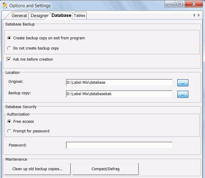
| Backup database | ||
| 1. Create backup copy on exit from
program 2. Ask me before creation |
1. Checked(Yes) 2. Checked(Yes) |
1. A backup copy of database is
created each time
you exit from Label Mix. Check "Do not create backup copy",
if
you do not want backup copy to be created 2. When checked, a confirmation dialog box will show for you to confirm data backup creation on exit from program |
| Location | ||
| 1. Original 2. Backup copy |
1. C:\Program
Location\Label Mix\database 2. C:\Program Location\Label Mix\databasebak |
1. Specifies the folder (or
directory) where the
original database is located on your system 2. Specifies the folder (or directory) where the backup copy will be located on your system |
| Security/Authorization | ||
| 1. Free access 2. Prompt for password 3. Password |
1. Checked(Yes) 2. UnChecked(No) 3. Empty |
1. Free access to database. Will not
prompt you to
enter password when the program starts. This means anybody using your
system will have access to the database, will be able to view, modify
or delete your records in the database. If you share your system with
other users, it is recommended that you set password, so that only you
or others authorized by you can have access to the database. 2. If checked, you will have to enter password before the program can load database. If you enter wrong or empty password program will load, but the database will not. Access to program customization page will also be denied. In other words, if you set "Prompt for password " and you enter a wrong password on program start-up, then database will not be loaded and you will not have access to all the configuration tools discussed in this section. 3. You may enter password in the box. Not less than 6 characters. |
| Option name |
Default Value |
Description |
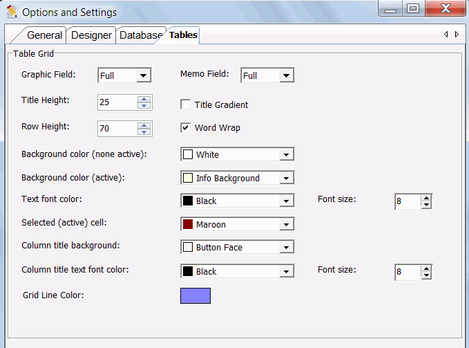
| 1. Graphic Field 2. Memo Field 3. Title Height 4. Title Gradient 5. Row Height 6. Word Wrap 7. Background color 8. Text font color 9. Text font size 10. Active cell color 11. Column title background color 12. Column title text font color 13. Column title text font size |
1. Full (yes). 2. Yes 3. 25pt. 4. No. 5. 70pt. 6. Yes. 7. White 8. Black 9. 8pt. 10. Money green 11. Button face 12. Black 13. 8pt. |
1. imgs/Picture (if exists in the record data) may be or
not displayed for the record in the table. Possible values* 2. Memo (if exists in the record data) will be displayed for the record in the table** 3. Height of the table title. 4. If you want to use gradient color for the title background 5. Height of the table rows 6. Display content as multi-line text if characters count is more than column width. If wrap is No (unchecked), ellipsis will be displayed when text doesn't fit width of column 7. Common background color for all tables 8. Common text font color for all tables 9. Common size for the font (in points) for all tables 10. Background color of the selected cell. 11. Background color of the column title. 12. Text font color for column title. 13. Font size (in points) for all tables' column title. |